|
|
Sometimes it's more convientent to display this information in the detailed view, as follows:

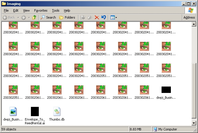
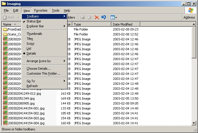
As displayed in the following snap shot, there are a variety of views available within Explorer; note that in this one, the word Details has a circle beside it, indicating it's the currently selected view.
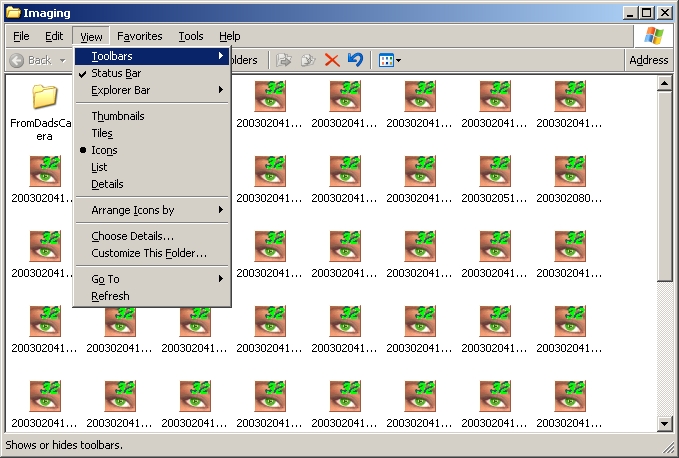
A snap shot of an icon view of a folder; again note that Icons has a circle beside it, indicating the view type.
Again, a detailed view of the folder.
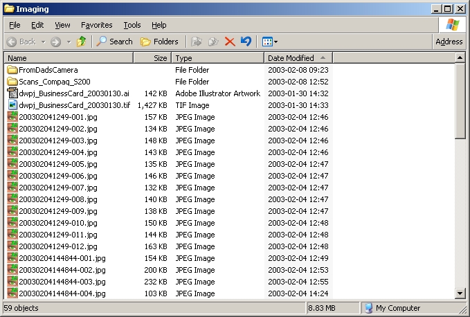
I prefer to organize the files by the date modifies, so that more recently modified or created files appear at the beginning or end of the list. Note that the word Modified in the menu again has a circle beside it. Also note that the list of files has a column that has the header Date Modified, and that there is an arrow pointing upward. I could also sort the files in the folder by clicking on the word Date Modified beside the arrow;clicking it again makes it sort from top to bottom, and vice versa; it's a toggle.
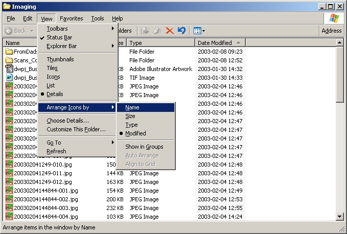
Notice the following snap shot has Name as the column the file listing is sorted on.
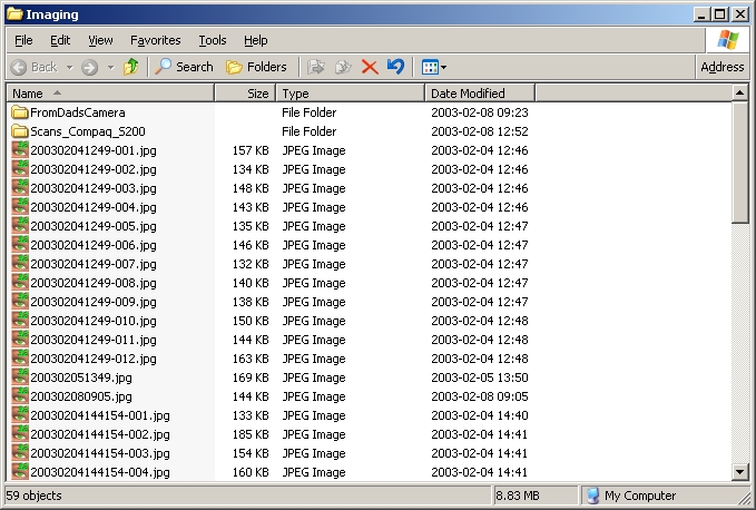
The following snap shot shows the menu command to order the file listing by name. With the exception of the display of the menu command, this snapshot is the same as the previous.
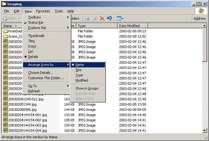
Changing the sort order of the file listing doesn't actually have any impact on the computer, other than to present information in a manner more interesting to the user, so there is no harm in doing this.